First we learn where the piece will live: in a pocket, on a counter, in an envelope, or on a wall. Then we choose the print method, price the run, and approve the layout.
We read the file like printers first
We check margins, bleeds, fonts, and color profile — before the sheet hits the press.
We choose materials in person
We’ll show paper and board by weight, brightness, and how they feel in the hand.
One person owns the order
A coordinator knows the project from the first email and walks it to a packed run.
A shop on Disston Avenue
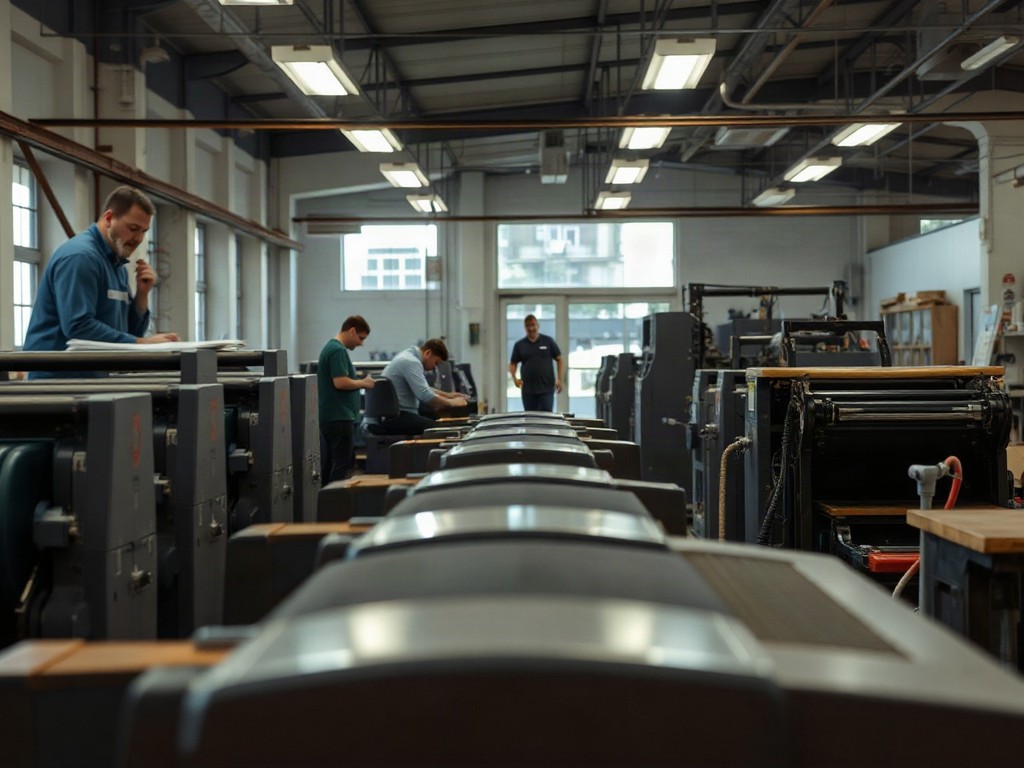
Impression Arc moves an idea from screen to paper
We don’t split jobs into “simple” and “special.” Each one has its own surface, rhythm, and work for human hands.
- Digital print for short runs and variable data.
- Offset when the run asks for steady color and a calm quote.
- Embossing, foil, and die-cutting — where touch adds meaning.
What leaves the press
Four paths from file to finished piece

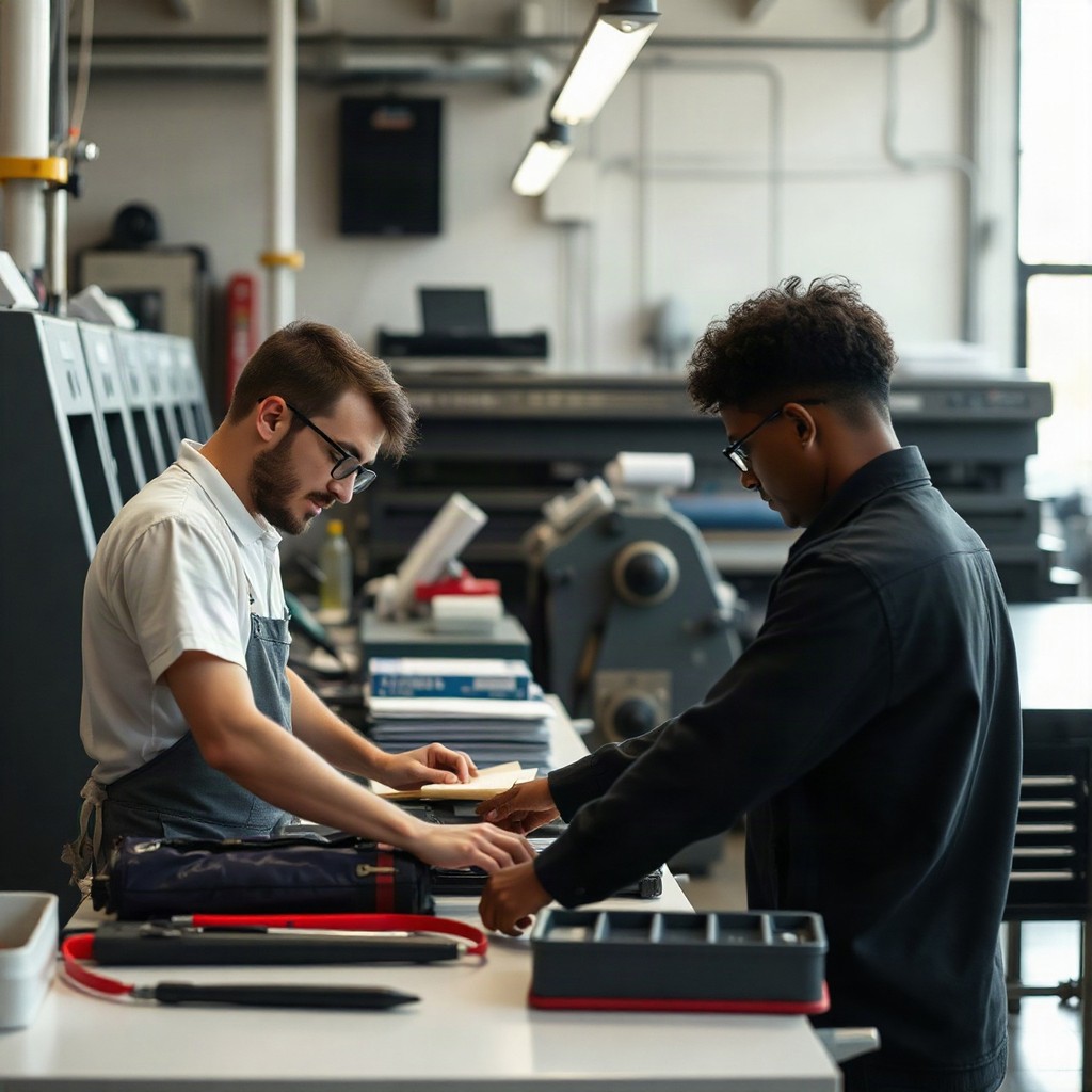
Brand stationery
Business cards, letterheads, cards, and folders built as one visual system.
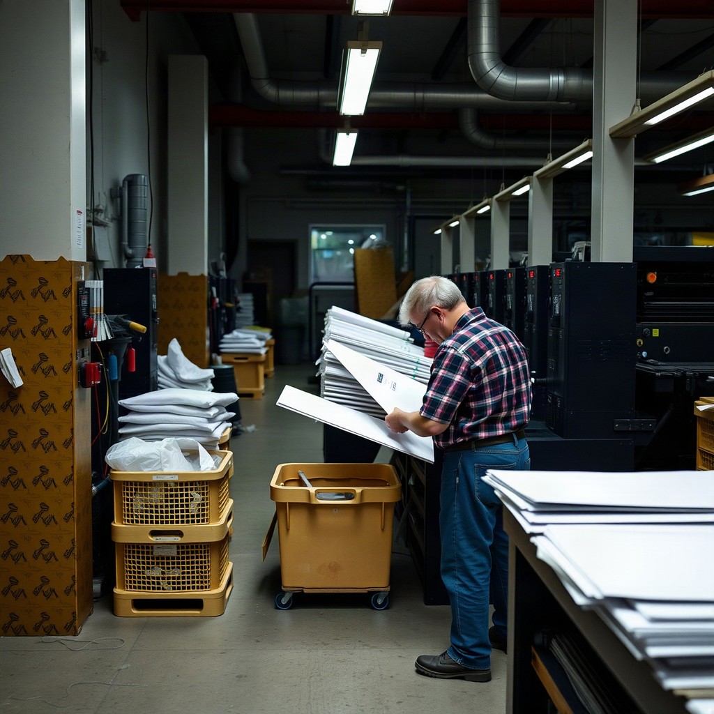
Boxes and labels
Sleeves, tags, and stickers with clean construction and careful finishing.
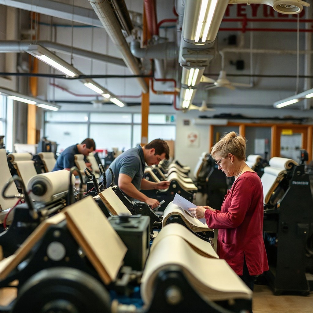
Publications and catalogs
Menus, brochures, and magazines with paced spreads and binding that matches how long they’ll live.
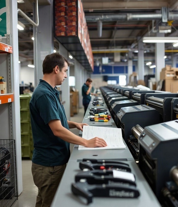
Print for events
Invitations, programs, posters, and wayfinding in one visual temperature.
How the path works
Work starts before the sheet meets ink
- A written spec before we start
- A color proof or sample piece when agreed
- Packing matched to format and pickup
2 details
that change
how a sheet feels
01
Paper sets the voice
A warm uncoated sheet sounds different from smooth, dense board.
02
Finishing is the accent
Foil, varnish, and relief belong where they support the idea — not where they drown it.
After the run
What people say once they’ve held the finished stack
Milo Shore
Our café menu lived only on a screen at first. Here they found a sheet that shrugs off steam and fingerprints, and fixed the contrast so the small type finally reads in daylight.


Briar Kett
We needed boxes for ceramics without extra decoration. The team simplified the die-line, kept a tactile board — and the piece felt like it belonged next to the ware itself.

Loretta Vayne
For a reading circle we printed a card set on three paper stocks. They suggested a spine in a different tone — a small detail that pulled the whole set into one story.


White isn’t one color: a note on paper temperature
How a sheet’s tone changes ink color, text contrast, and the feel of a layout.
Bleeds, trim, and traps: what to check before you send the file
Five technical details that decide whether a run sits clean or argues with the knife.
A name on the sheet: when variable data feels like a gesture
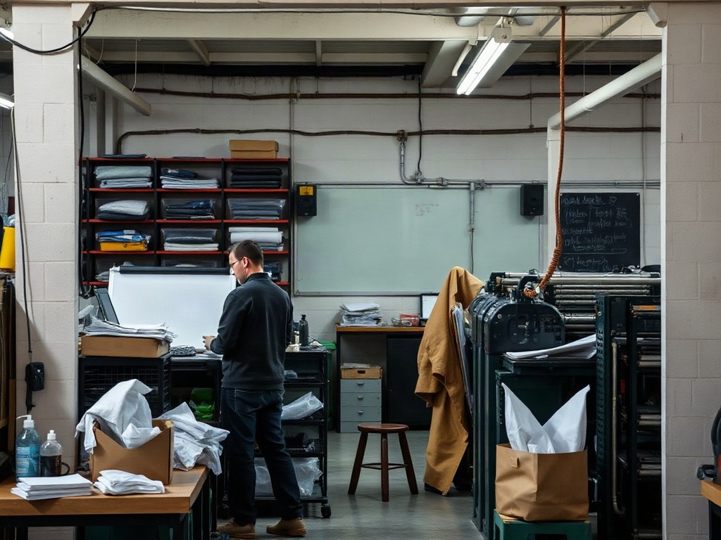
Numbers, greetings, and swapping images turn a run into a set of personal copies.